Gov 1347
Samuel Lowry
Urban vs. Suburban
December 10, 2020
Since the election, political pundits have been putting forth theories with varying accuracy as to why things shook out as they did. In the case of Michigan, media outlets and Twitter gave much of the credit for Biden’s victory to Detroit. In Georgia, Stacey Abrams’ voting rights and voter registration work has been cited—specifically its effect on turnout in Atlanta’s suburbs. I seek to delve into where ought the credit actually be given for Biden’s ability to flip both of these states. Should it go to the cities, the suburbs, or a combination of the two, and what is the answer’s implication?
This discussion has large implications for campaigns going forward. Where ought they be investing their time and resources? Should Democrats try to convince suburban moderates to vote blue or should they emphasize voter registration to key vastly Democratic demographics groups, as Stacey Abrams has proposed?
In order to attain some evidence, I first looked at what counties have shifted Democratic compared to 2016. Second, I calculated the change in Democratic voters by county. Third, I normalized this figure for population by finding the percent of Democratic voters per county that were additional compared to 2016. The shift in win margin displays where Biden is gaining, but the number of people that voted is really what matters in winning elections—hence the inclusion of the raw numbers of the additional Democratic votes. Nevertheless, the raw numbers only highlight population centers necessitating analysis of the proportion of additional Democratic voters per county. Lastly, I ran a number of regressions with a discrete county type variable as a predictor of both the shift win margin and the normalized additional Democratic voters. The county type variable was taken from the National Center for Health Statistics’ 6-level urban-rural classification scheme where 1 represents the most urban counties and 6 the most rural. I shifted the values, though, to range from 0-5 for the sake of the regression. Nevertheless, in my following discussion, I will still utilize the 1-6 language.
What counties became bluer?
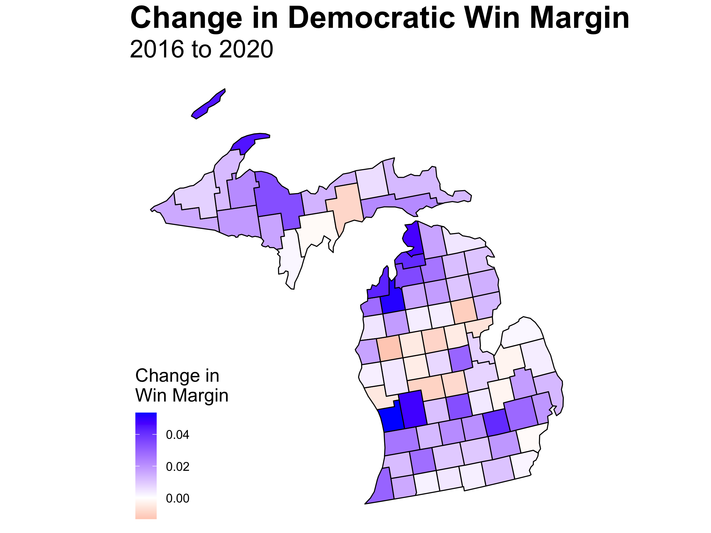
First off, Michigan counties largely shifted blue. Only 15 out of 83 (18.07%) counties voted more predominantly for Trump than in 2016 surprisingly including Detroit’s Wayne County. The counties with the largest shifts were Ottawa (which happens to be my home county), Grand Traverse, and Kent. Ottawa is a 2 on the urban-rural scale while Grand Traverse is a 5, and Kent is a 1 due to Grand Rapids. Of the 10 counties that shifted the most Democratic, the average rating is 3.9 which isn’t even a suburb. In Michigan, it is not just cities and suburbs that are getting bluer.
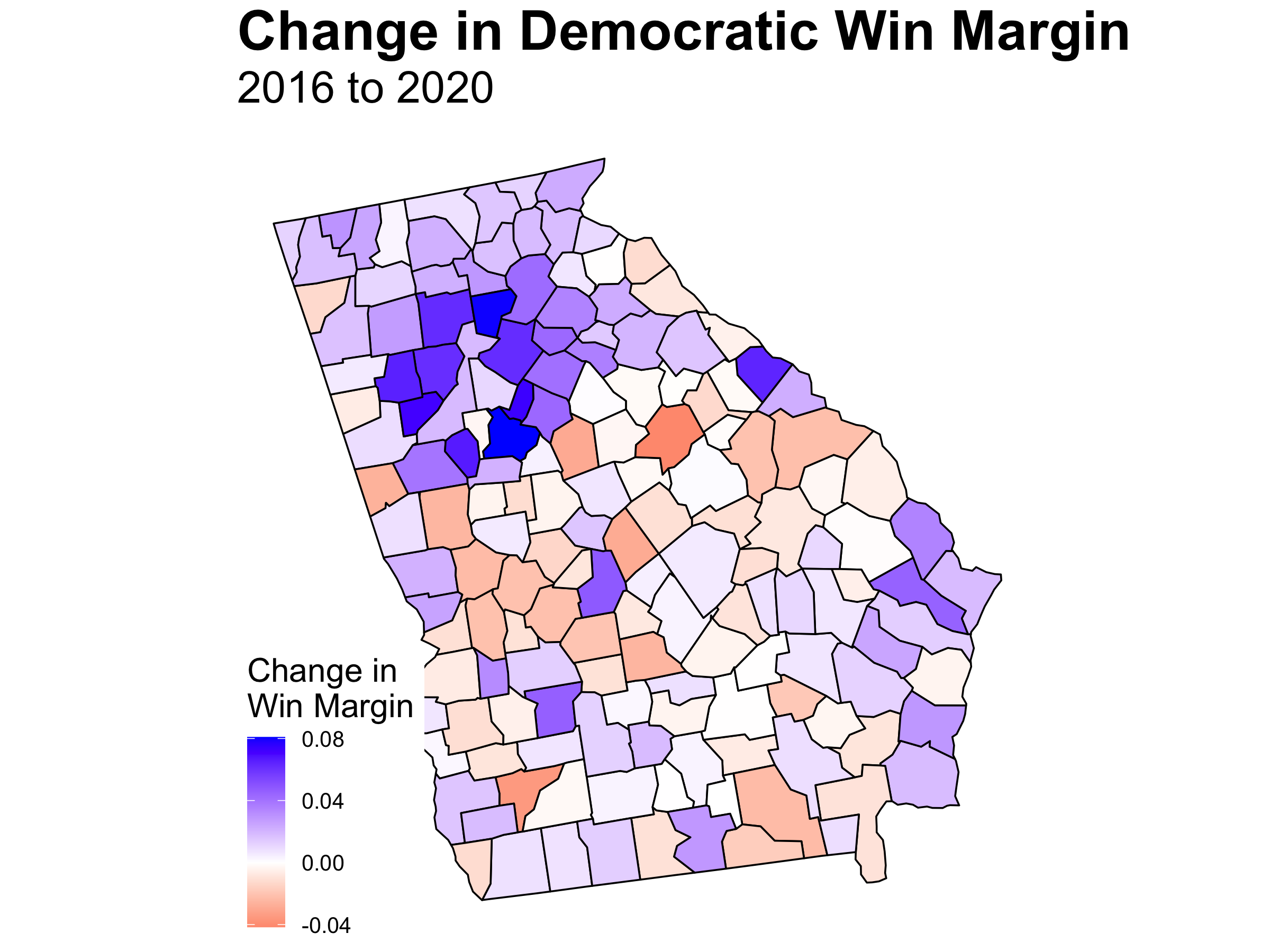 Georgia is a little bit of a different story with 66 and out 159 (41.51%) counties voted more predominantly for Trump than in 2016. In addition, Biden’s gains are centered around more populace areas. The top 3 blue shifted counties—Henry, Forsyth, and Rockdale—are all suburbs of Atlanta. The average score for the top ten Georgian counties is 2.1. The suburbs voted more predominately for Biden.
Where did the new votes come from?
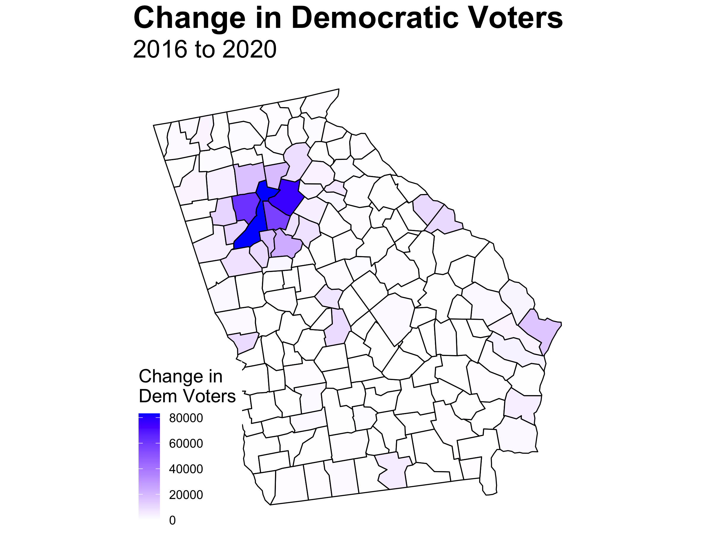 Nevertheless, even though the suburbs shifted blue, the additional Democratic votes as compared to 2016 came from the Atlanta proper with Fulton, Gwinnett, and Cobb leading the way. Granted, Henry and Forsyth slotted in at 5 and 6. At the same time, this map largely just reflects a population density map. Of course more votes would come from Urban areas.
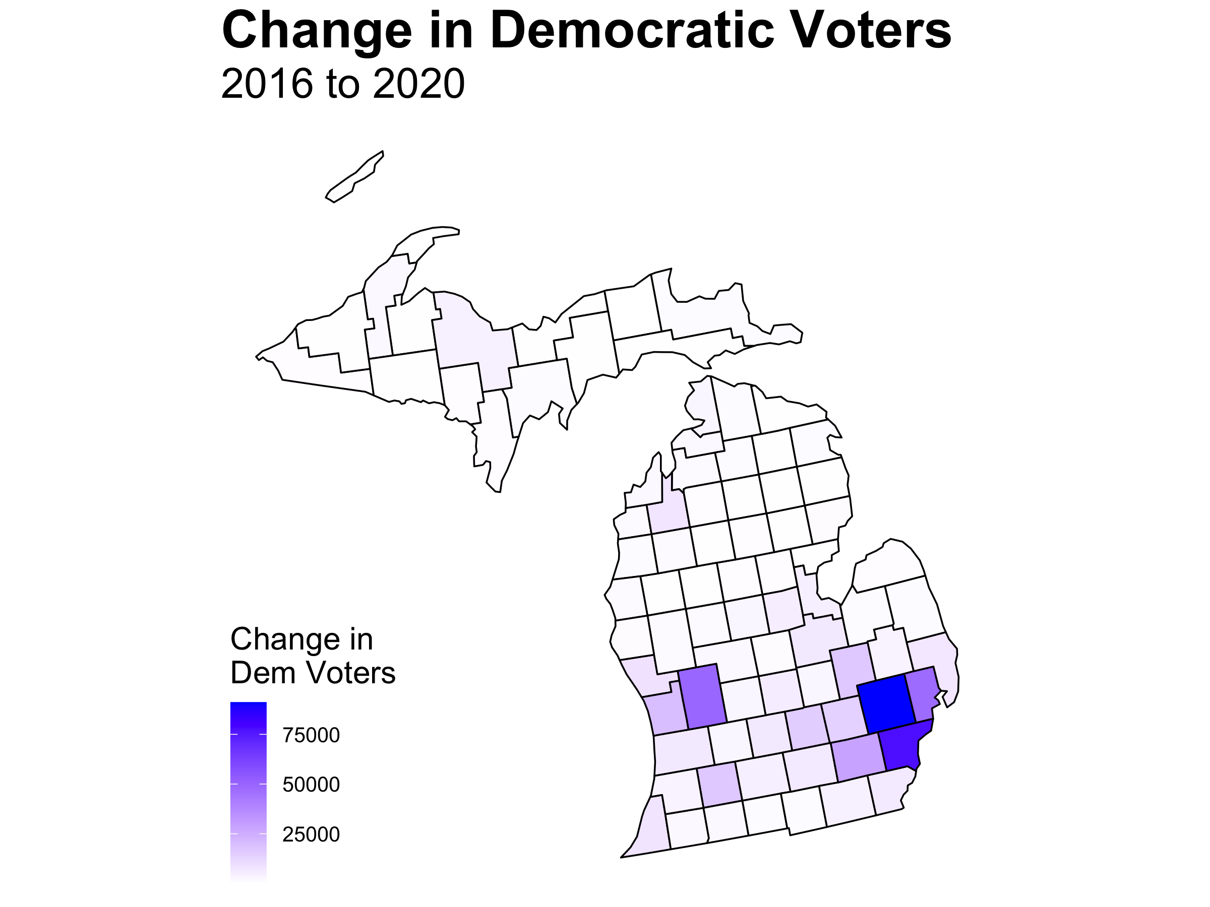 The same is true in Michigan with Detroit and Grand Rapids leading the way with Oakland County a deep blue square. These maps merely show population centers.
What counties pulled their weight?
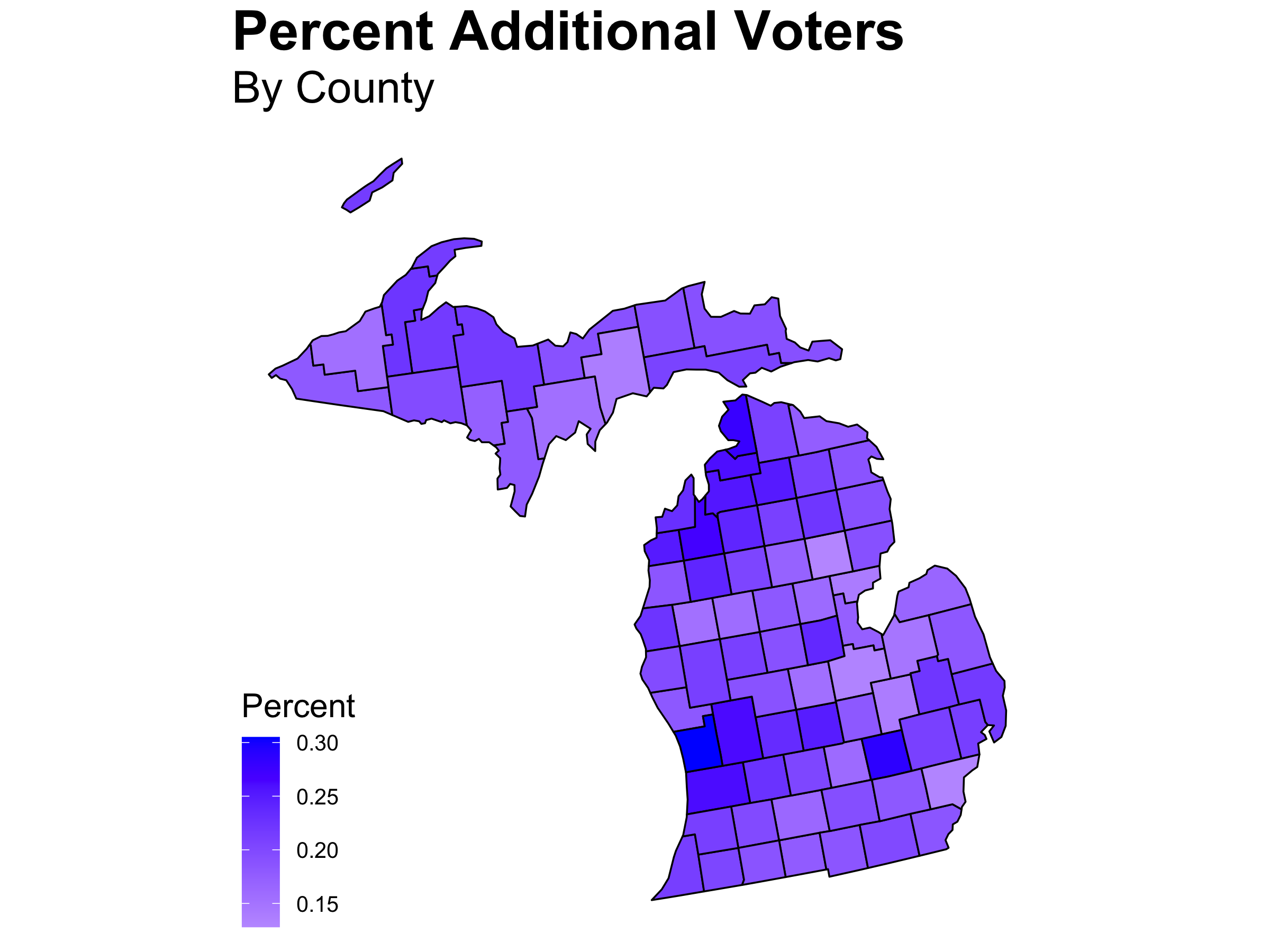 Therefore, I wanted to see what counties had the biggest share of additional Democratic voters compared to 2016 as a proportion of the Democratic vote. While Democratic turnout was up across the board compared to 2016, truly urban areas do not stand out in Michigan. The top 10 average urban-rural score was again 3.9 even though there was not complete county overlap with the win margin shift average.
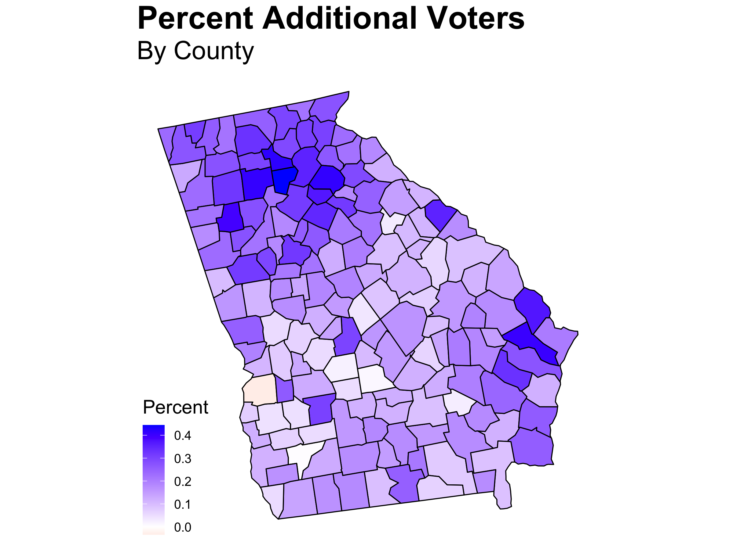 Georgia, with only one county that had a lower Biden turnout than what Hillary had in 2016, is still not as blue across the board as Michigan. In addition, its top 10 average urban-rural score is .7 of a point higher than the shift in win margin average which is close to leaving the bounds of a suburb that ends at 3.
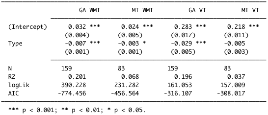 To be a tad more empirical about this than my top 10 averages, I ran a regression using the shifted urban-rural score to predict the change in Democratic win margin and the proportion of additional Democratic voters compared to 2016. On the regression table, WMI stands for “Win Margin Increase,” and VI stands for “Voter Increase” in regard to the proportion of additional Democratic voters. In both states, we can be confident that the more urban the area, the more likely it was to shift bluer. Nevertheless, notable exceptions exist such as Wayne County, and the coefficient for Michigan is less than half of that for Georgia. The proportion of additional Democratic voters follows the same trend in Georgia with the largest coefficient of all the models, but in Michigan it is inconclusive. In other words, there is not an association between the type of county and the proportion of additional Democratic voters.
In conclusion, while only a piece of the puzzle, my evidence suggests that the Atlanta suburbs were of the utmost importance. On the other hand, in Michigan, while Detroit saw a surge in votes, urban counties did not proportionally outperform suburban and rural counties. From this, Democratic campaigns ought to keep two things in mind: 1, You are still probably going to get your votes from the cities. 2, But cities do not necessarily proportionally outperform less densely populated areas. Therefore, I would suggest Democratic campaigns to look further into counties in Michigan, like my home county of Ottawa, for they could hold pearls of wisdom as to how to increase win margin in more urban areas.
The 2016 data is from the MIT Election Data + Science Lab and can be found here. The 2020 data is from Raphael Fontes’ page on kaggle and can be found here. The county coding data is from the CDC and can be found here. The code to replicate the above graphics can be found here.